Bitcoin
Bitcoin’s uptrend is only beginning and here’s proof

In the cryptocurrency world, every sign is a bullish sign. From China getting into blockchain, to Facebook launching its own cryptocurrency, to Donald Trump tweeting about Bitcoin, nearly everything can be construed to be a sign of the upcoming bull run. Needless to say, not all of these signs actually have any backing behind it.
When everything is a sign of a bull run, well, nothing is. However, looking at the actual price of Bitcoin against its previous trend, one can find signals that are worth their salt. Even if these signals aren’t flushed with ‘Bitcoin to the moon,’ they usually have one or two key points which suggest that the swing, in either direction, is strong or stronger than it has been previously. We have one such signal for you.
Looking at the Bitcoin markets of late, one would think that the bears have taken over. With a drop to $10,000 from over $12,000 after nearly a full month of holding strong, a collapse to four-digits is likely. While the initial hesitancy of the drop can override the long-term market feeling, a look at the data would suggest that Bitcoin’s price has just crossed a major threshold, despite the drop.
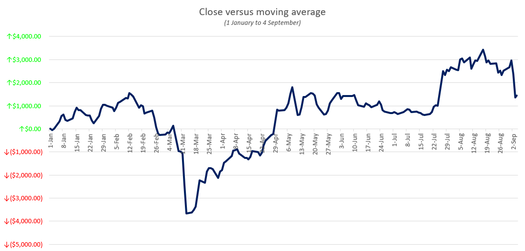
Plotting Bitcoin’s daily close against its yearly moving average presents a good snapshot of where the current price stands against its YTD value. Based on this premise, the drops of 12 March would have a huge impact on the MA because of two reasons – the severity of the crash (around 50 percent of the trading price) and the timing (72 days since the beginning of the year). Just that one day drop increased the difference between the BTC daily close price to its moving average from less than $1,000 to over $3,500.
The above chart plots the daily difference between Bitcoin’s closing price and its yearly moving average from the beginning of the year to the most recent drop on 4 September. Unsurprisingly, the difference began rising after the drop in March and has been increasing every day since then, with the current trading price closing the distance against the average.
Now, looking at how that gap has closed is important. Prior to the drop, the highest point of the moving average was $8,988, recorded on the 26th of February when Bitcoin rose above the $10,000 mark for the second time. While its rise above the level didn’t last long, it pushed its average up. Since then, the average has been consistently dropping, made worse by the March drop. However, at the beginning of September, the yearly moving average jumped over the 26 February-mark, marking a high of $9,028 on 1 September.
If you’re thinking the crash down to $10,000 on 4 September affected the average, it didn’t. The average has been consistently rising due to the number of days Bitcoin has maintained its price above $10,000 since the end of July. As things stand, the average is at $9,141, less than $1,200 away from the trading price of Bitcoin, but still, a good distance considering it took nearly four months to close the gap between $8,200 to $9,000 in the first place.
The chart below plots the daily close price of Bitcoin against the moving average, and you can see that the latter is crossing above its previous highest point in February.
To conclude, Bitcoin’s recent price run has not only pushed its current price higher, but also its yearly average. This is not just a positive sign in the here and now, but shows that the price surge is not a mere “pump,” but has enough backing to sustain itself for quite some time.
Source: Coinstats

